
-
![]()
CUSTOM LOGOTYPE DESIGN
-
![]()
CUSTOM LOGOTYPE DESIGN
-
![]()
BRAND SYMBOL
-
![]()
BRAND 'L' DEVICE
-
![]()
BRAND 'L' DEVICE
-
![]()
BRAND VISUAL SYSTEMS
-
![]()
BRAND VISUAL SYSTEMS
-
![]()
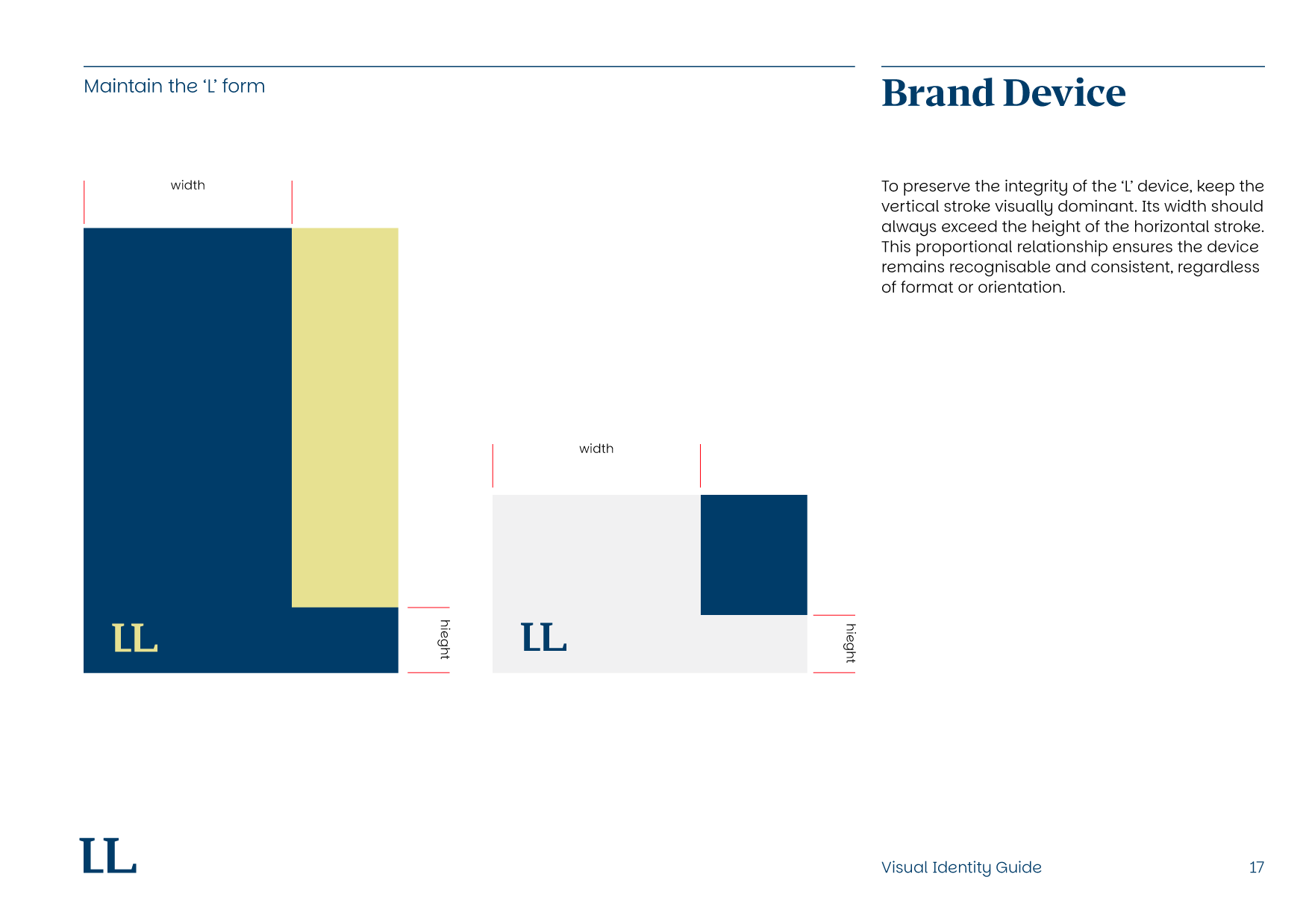
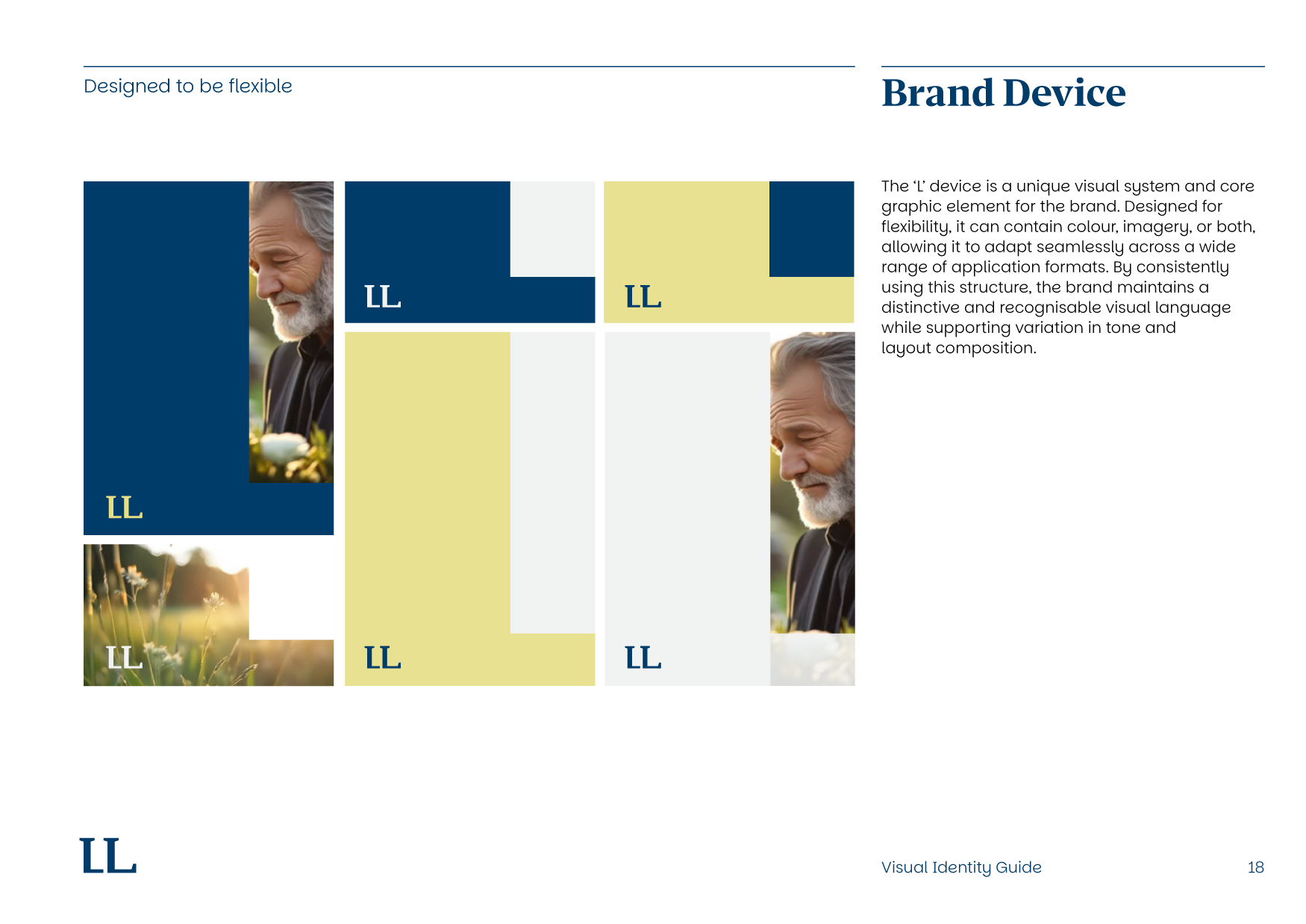
BRAND DEVICE GUIDES
-
![]()
BRAND DEVICE GUIDES
-
![]()
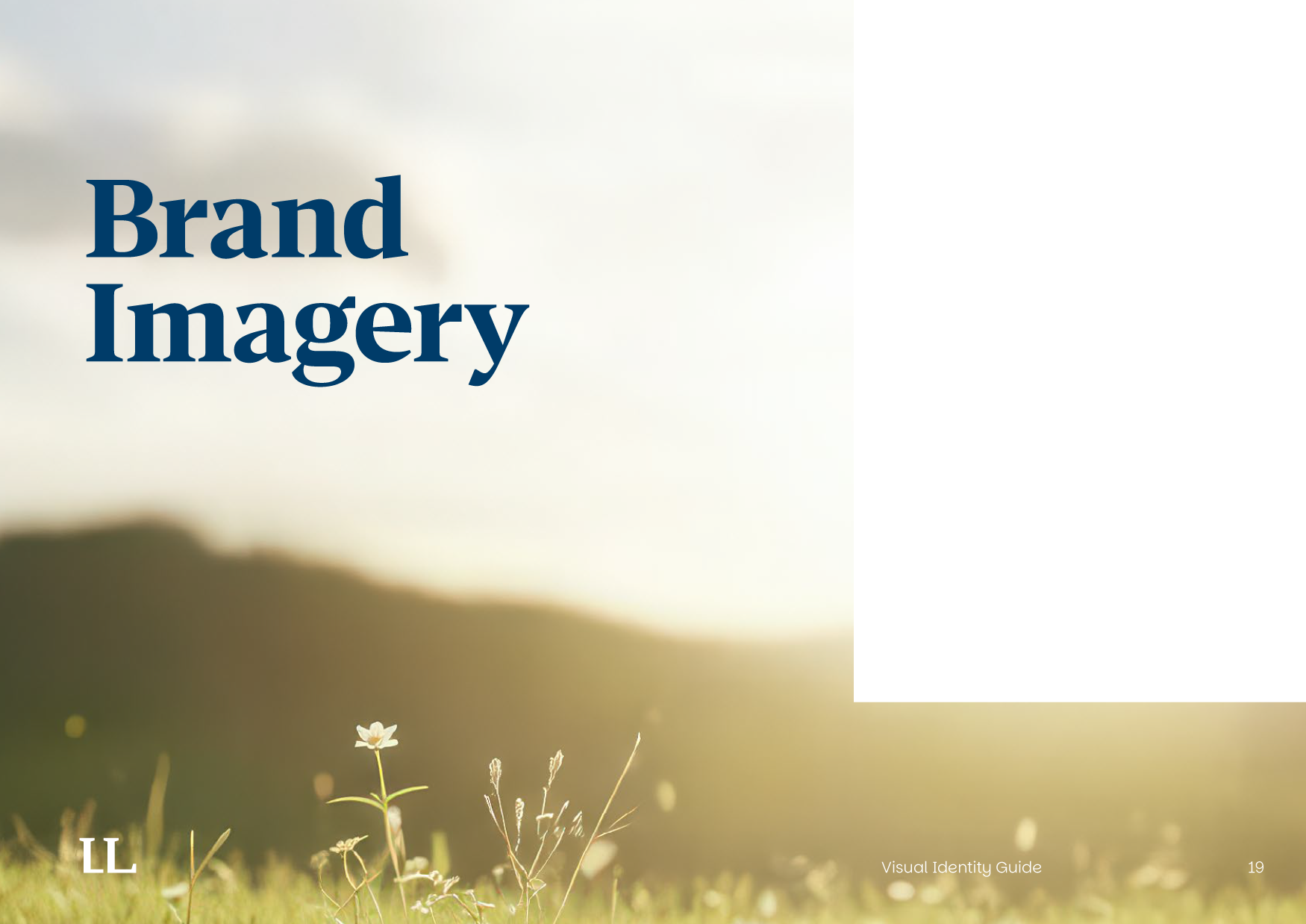
BRAND IMAGE STYLES
-
![]()
BRAND GUIDE EXAMPLES
-
![]()
BRAND GUIDE EXAMPLES
-
![]()
BRAND GUIDE EXAMPLES
-
![]()
BRAND GUIDE EXAMPLES
-
![]()
BRAND GUIDE EXAMPLES
-
![]()
BRAND GUIDE EXAMPLES
-
![]()
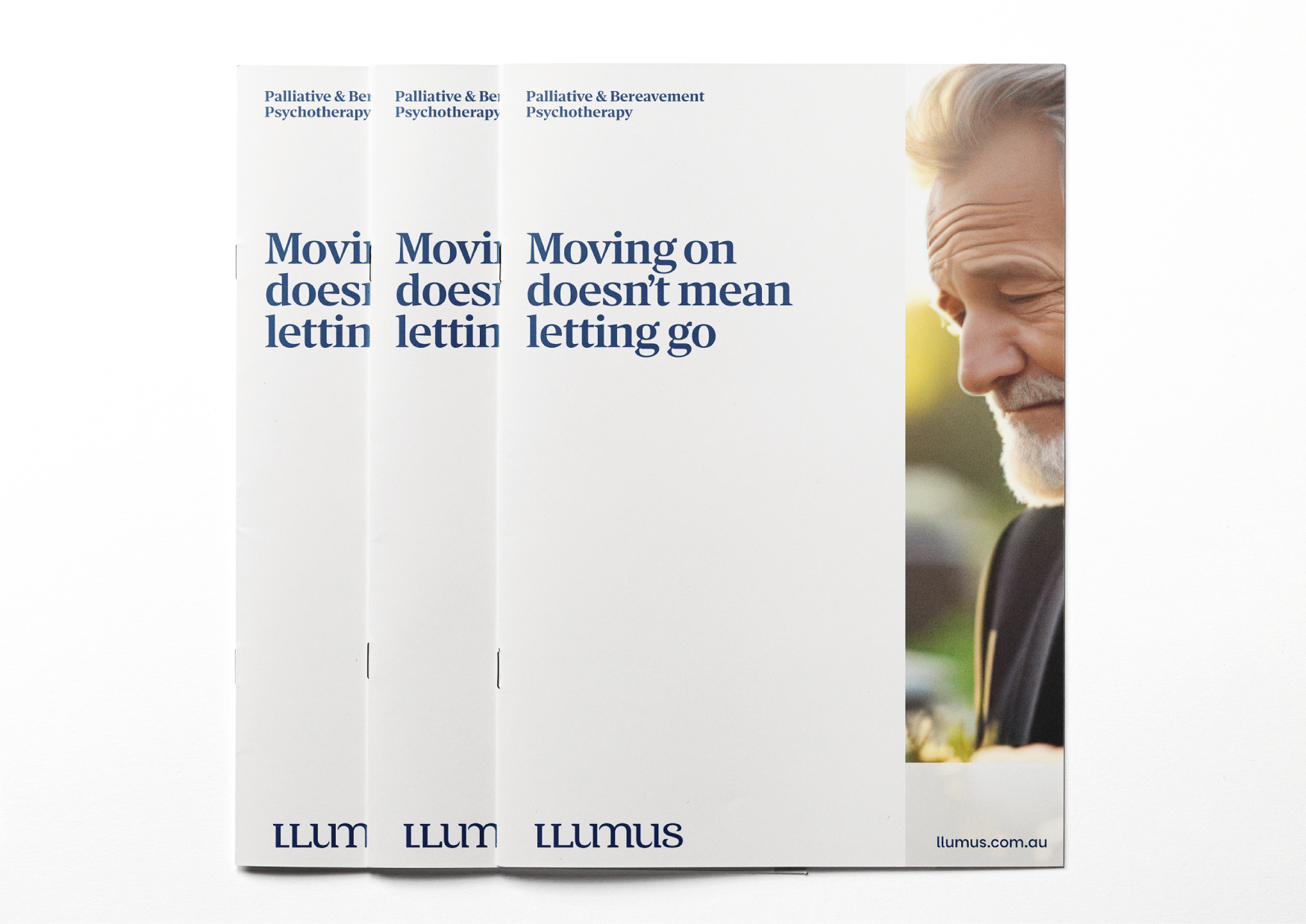
BROCHURE COVER


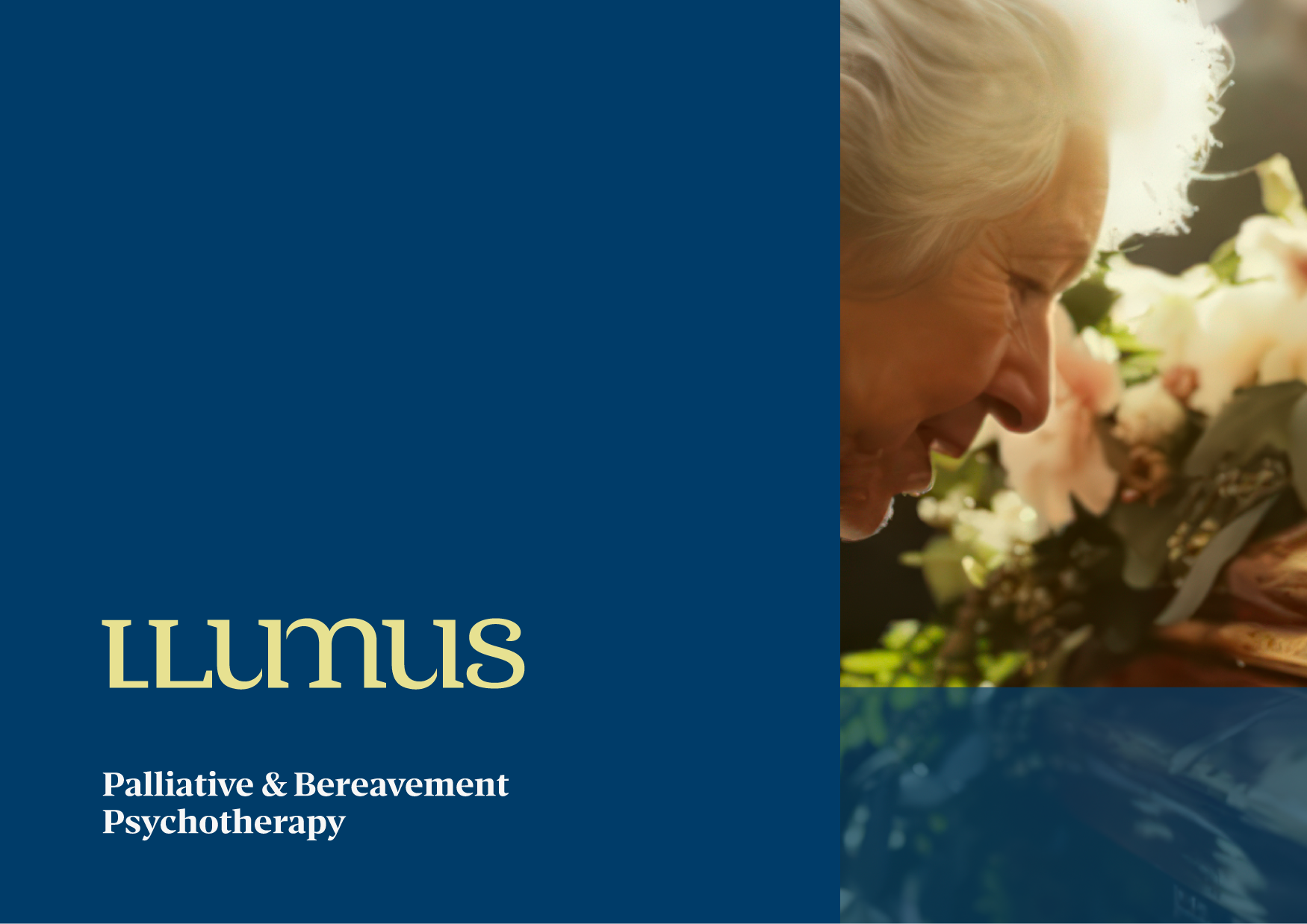
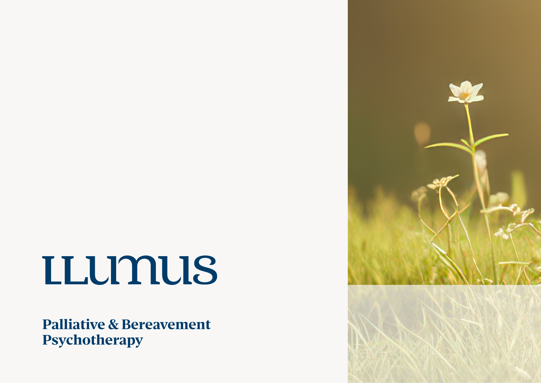
LLUMUS
VISUAL IDENTITY
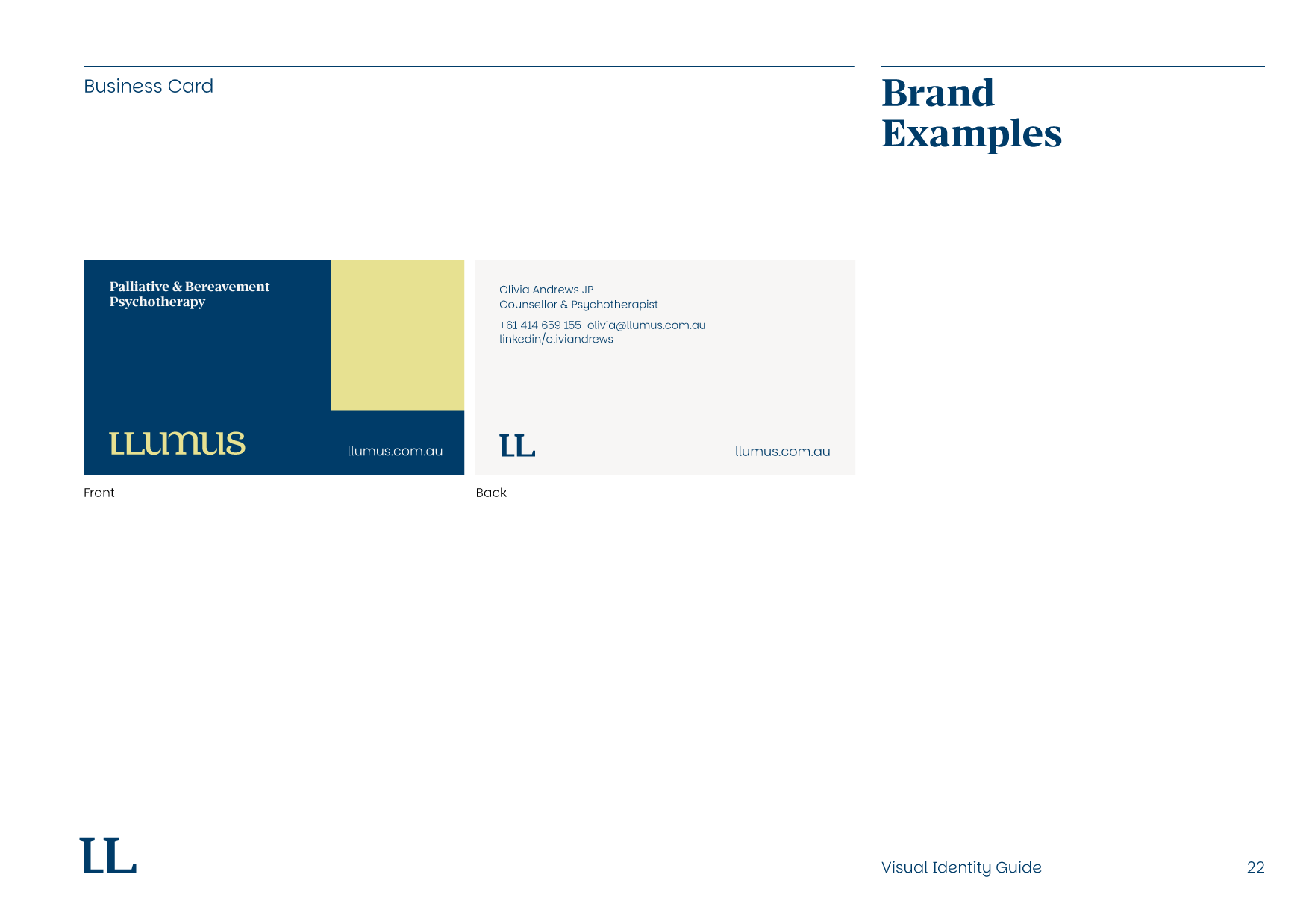
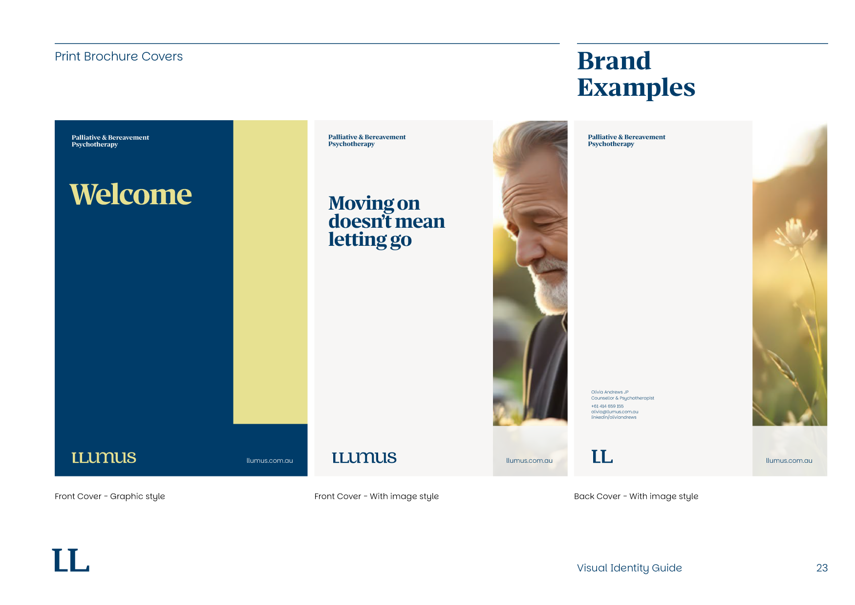
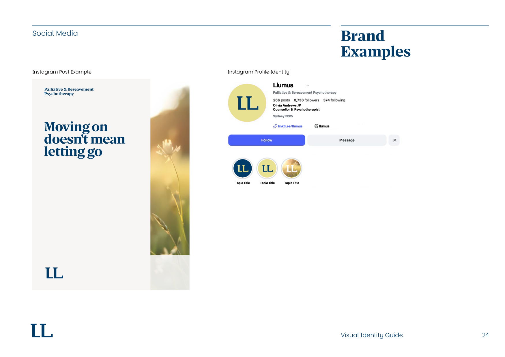
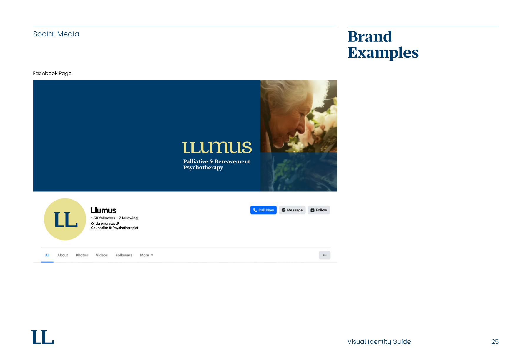
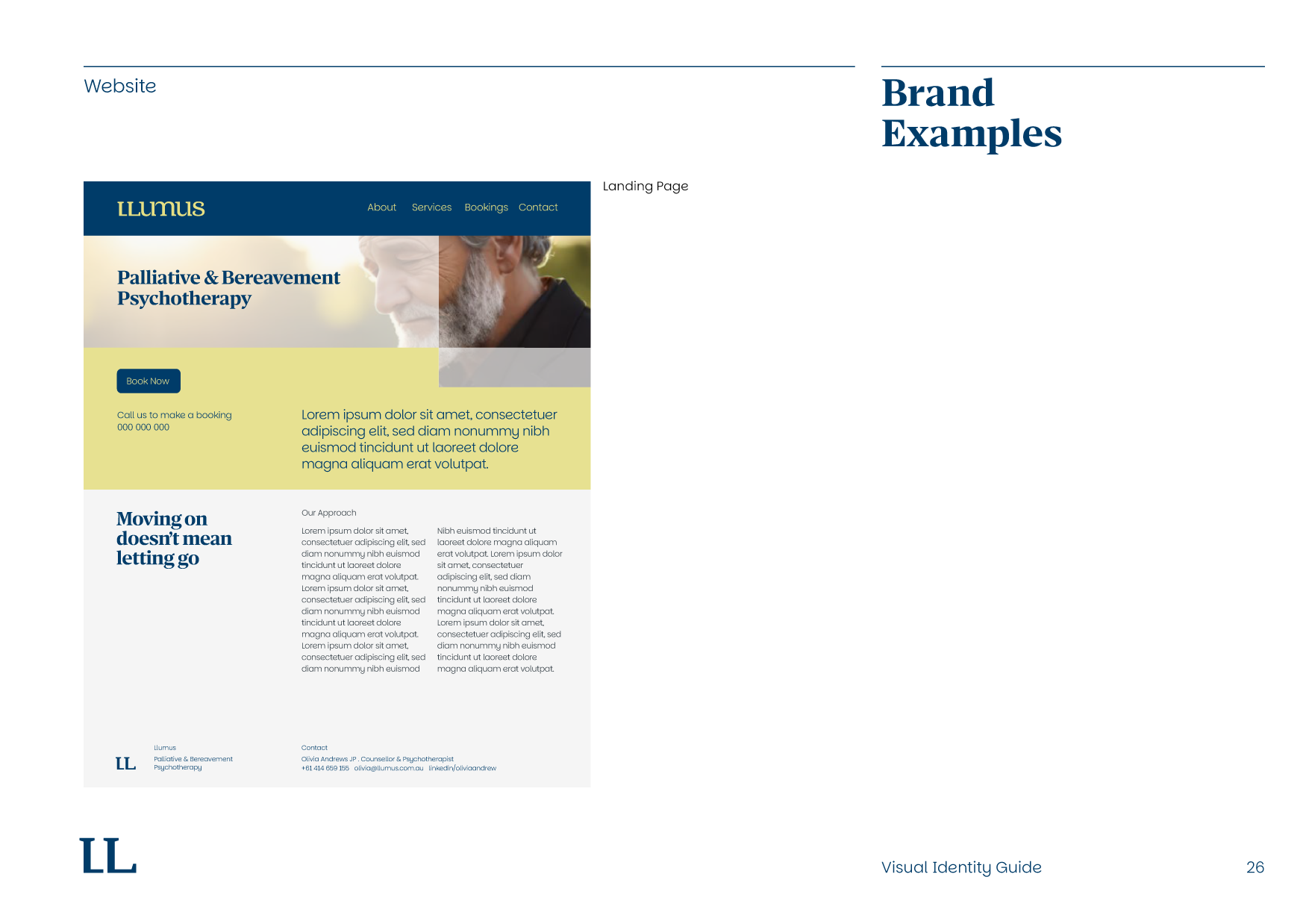
Llumus is a Sydney based palliative and bereavement psychotherapy practice focused on supporting themes of healing, transition and renewal. We developed a complete visual identity system for the brand, creating a quietly confident and professional visual language that symbolises emerging light, transformation and human connection.
At the centre of the identity is a custom designed Llumus wordmark featuring interwoven serif letterforms with soft curves and tapered details, creating a distinctive logo that feels both established and contemporary. Supporting the identity system is a secondary ‘LL’ symbol, a symbolic ‘L’ brand device,
a refined typography system and a restrained colour palette built around Night Blue and
Morning Yellow tones.
Beyond the logo design, we developed a comprehensive visual identity guide outlining the complete brand system, including typography, colour application, photography direction and a wide range of print and digital brand application examples. The project was delivered with complete artwork files, strategic visual thinking, creative direction and identity rollout consultation.
What we did:
Visual Identity Strategy & Concept Development
Logo Design & Brand Mark System
Complete Visual System Development
Typography, Colour, Visual Devices Systems & Photography Styles
Comprehensive Visual Identity Guide with Brand Application Examples
Creative Direction & Design Consultation